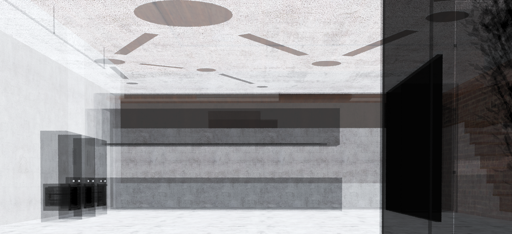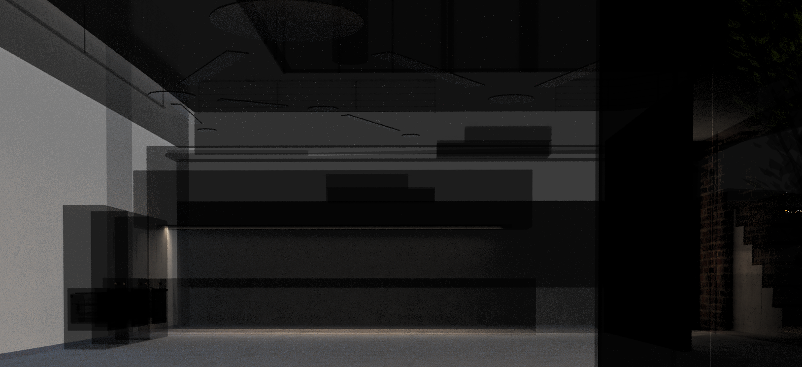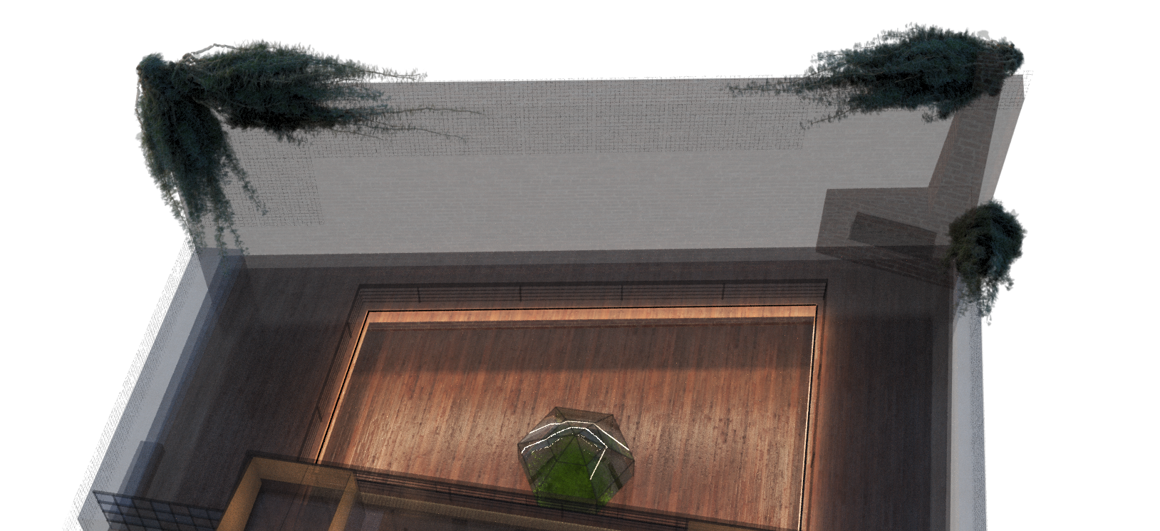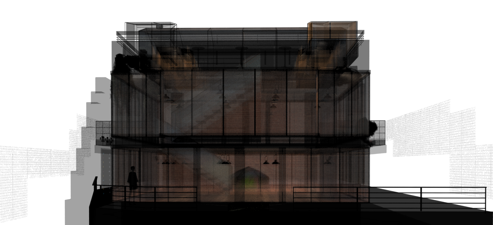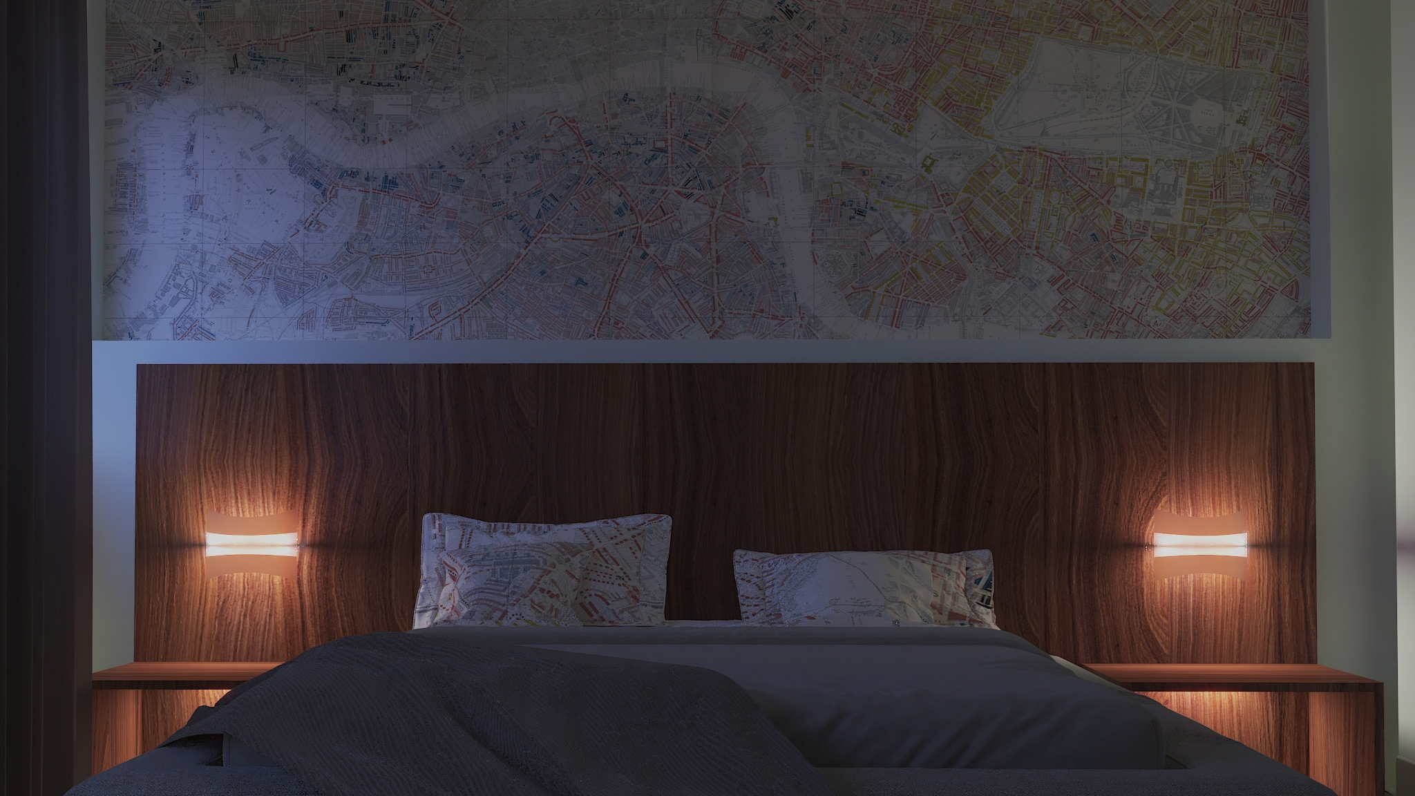
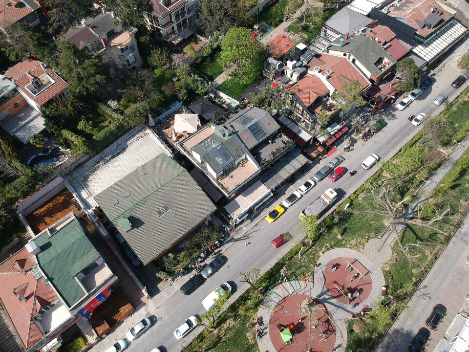
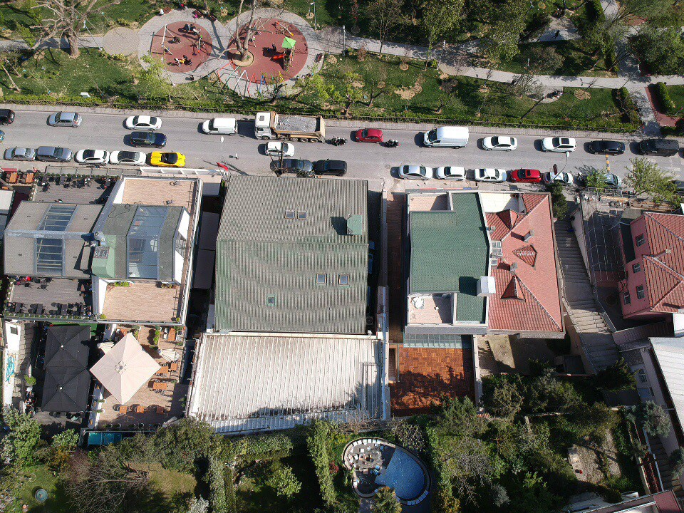
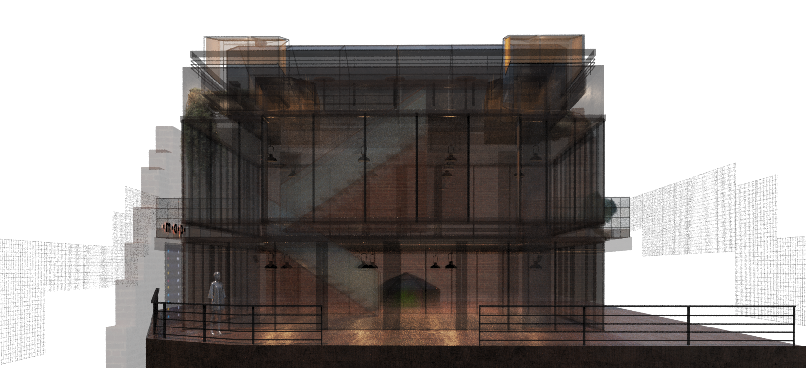
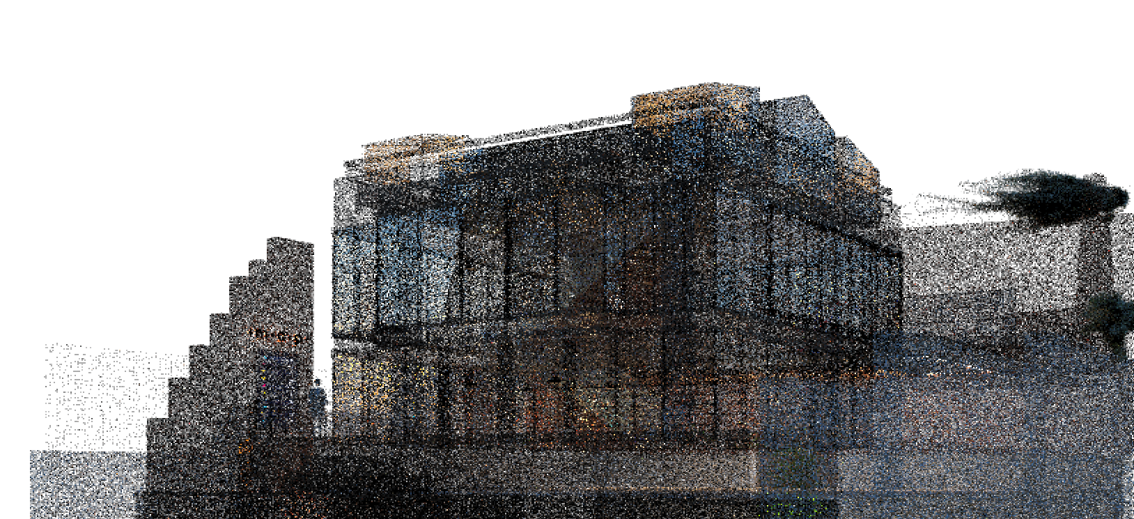
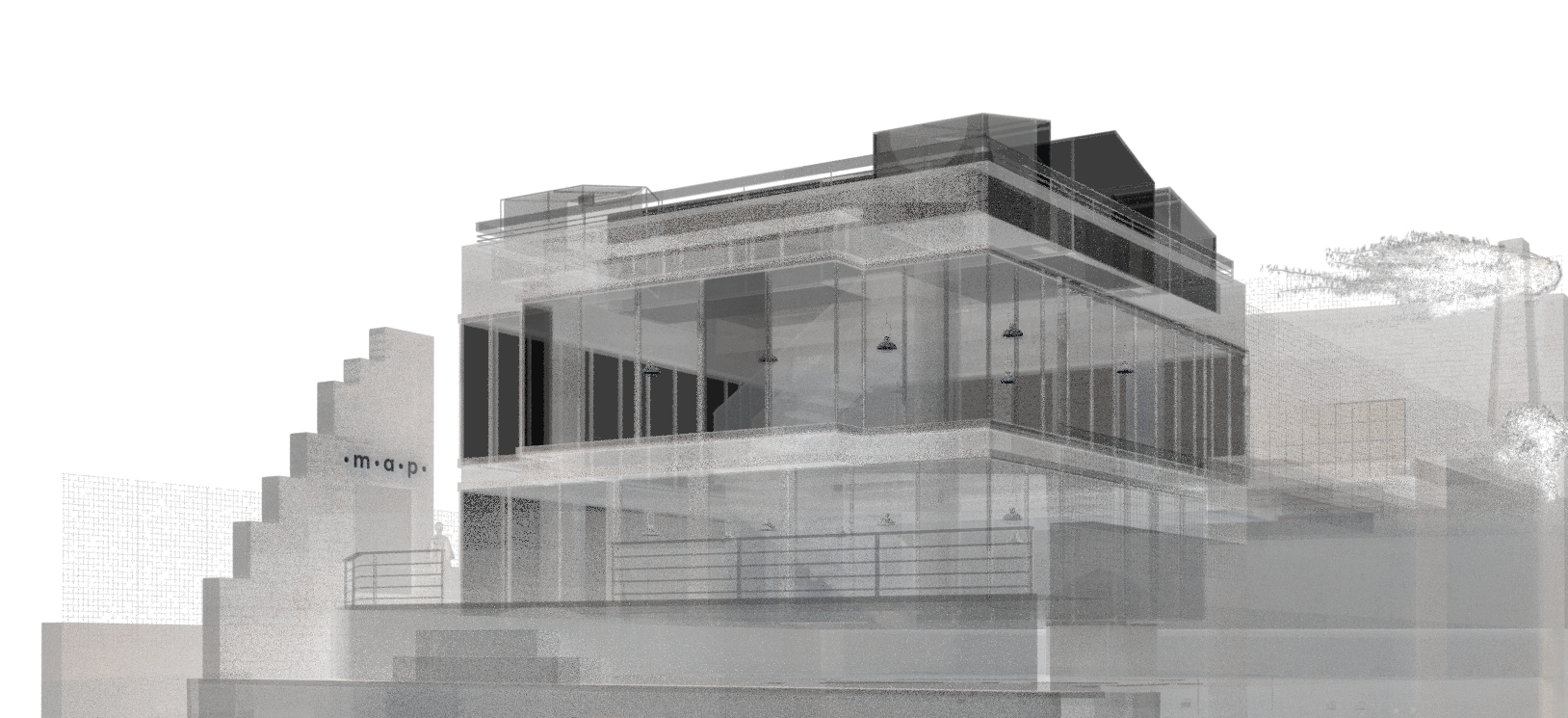
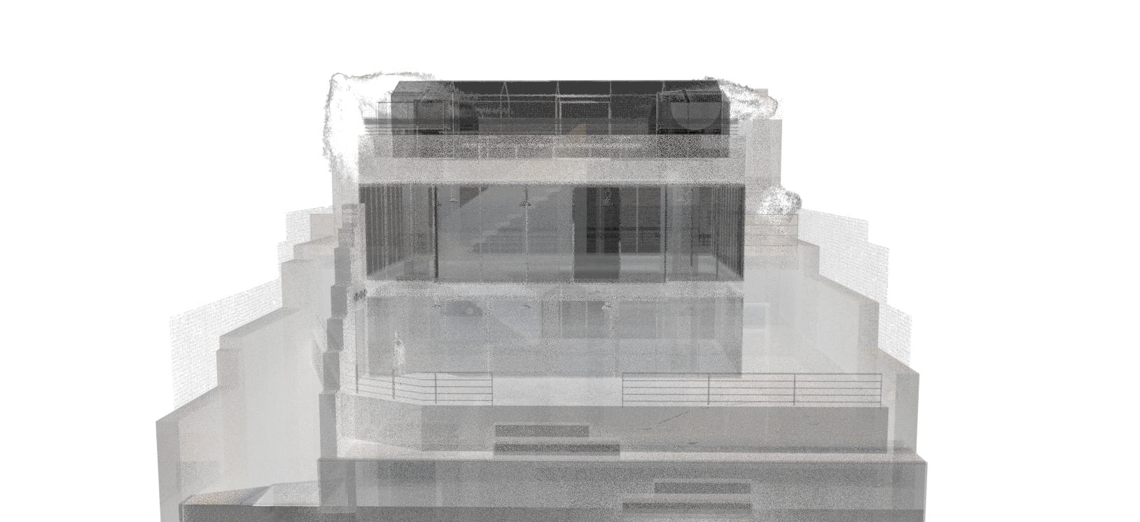
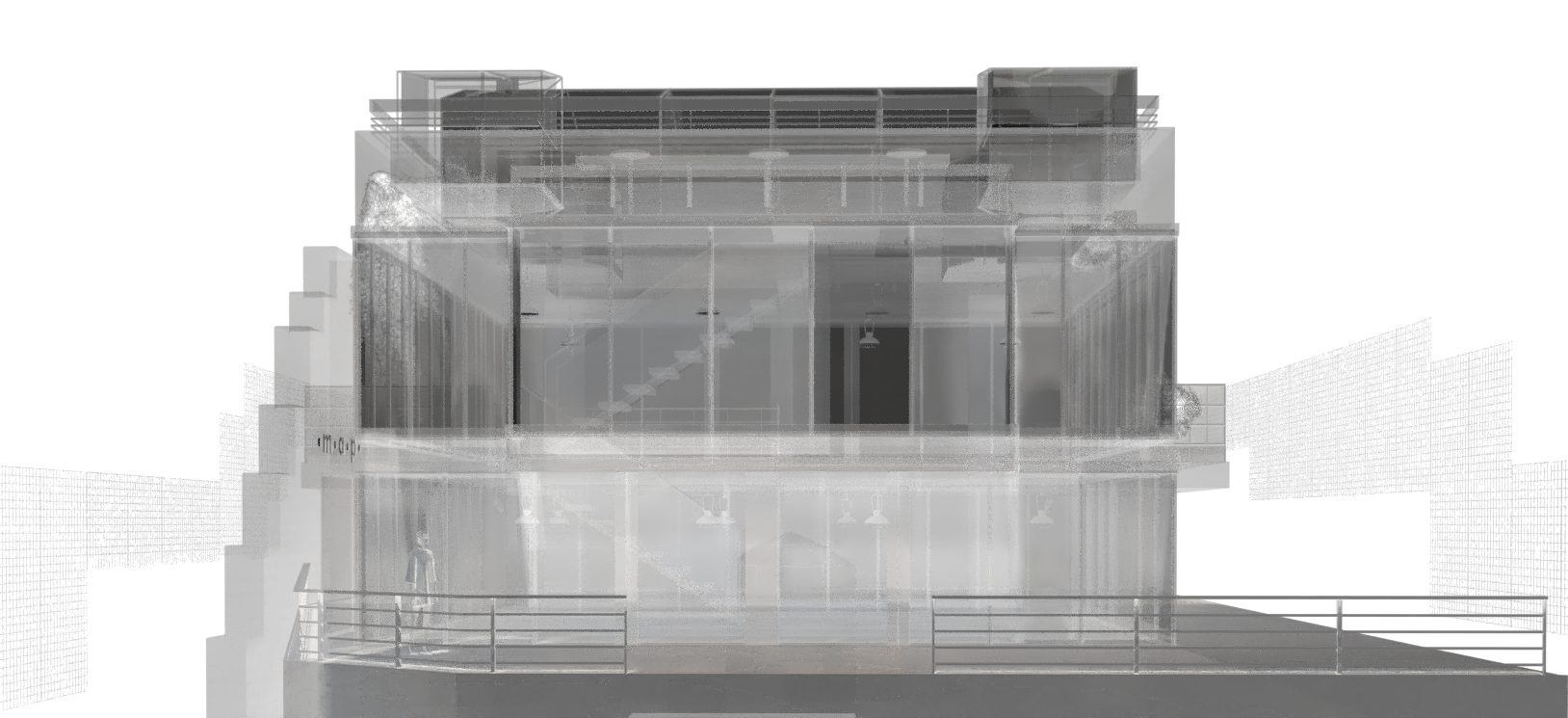
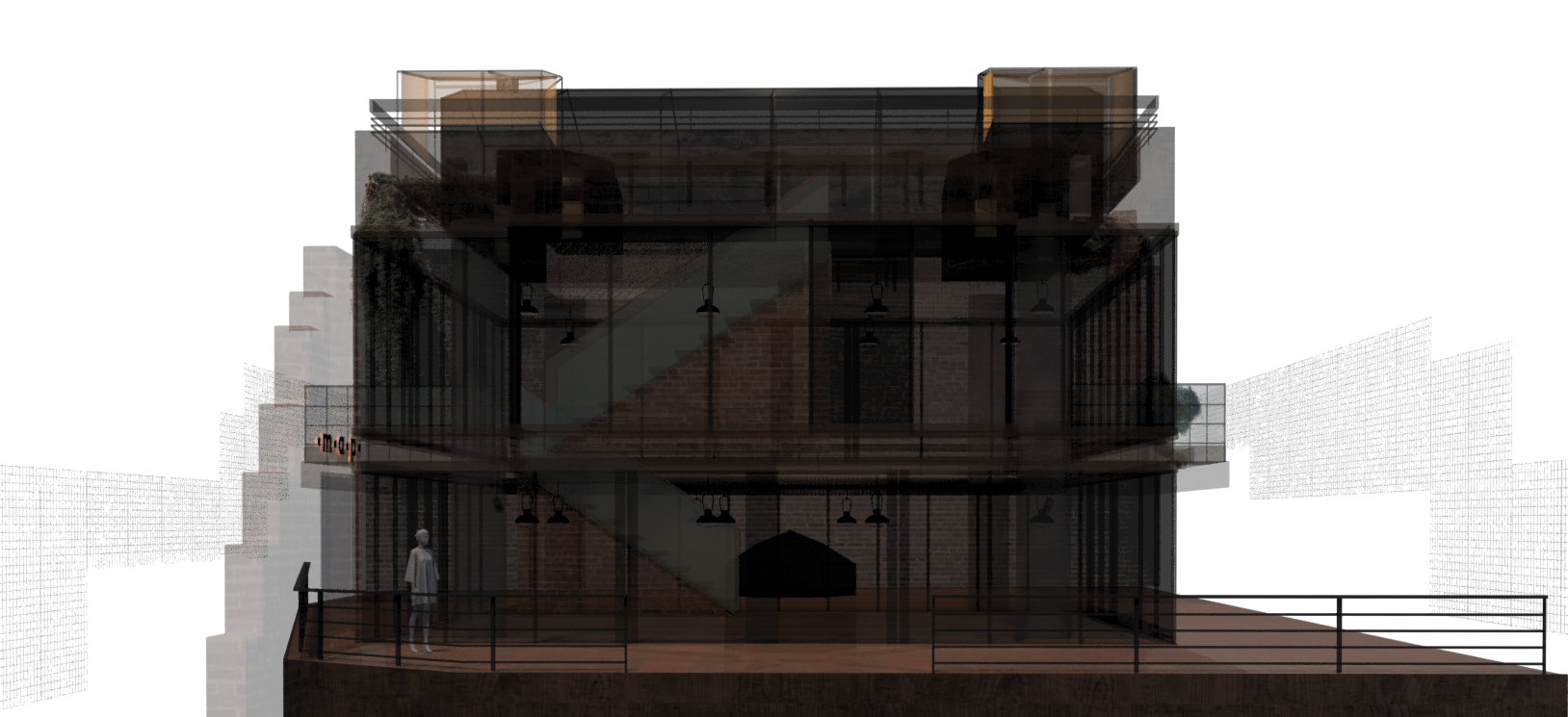
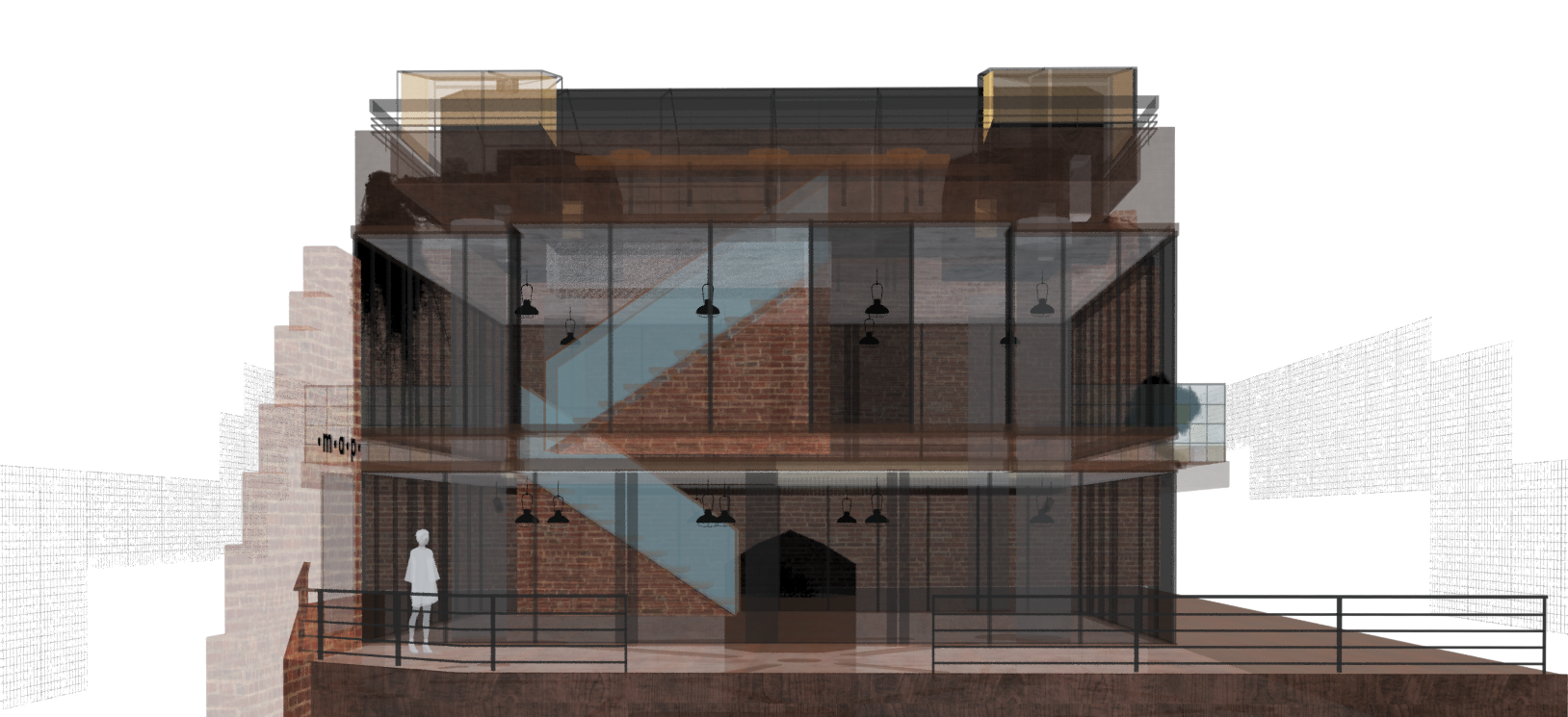
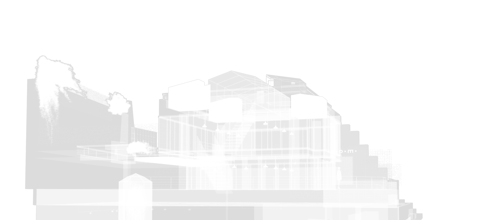
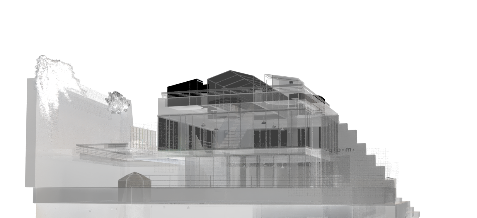
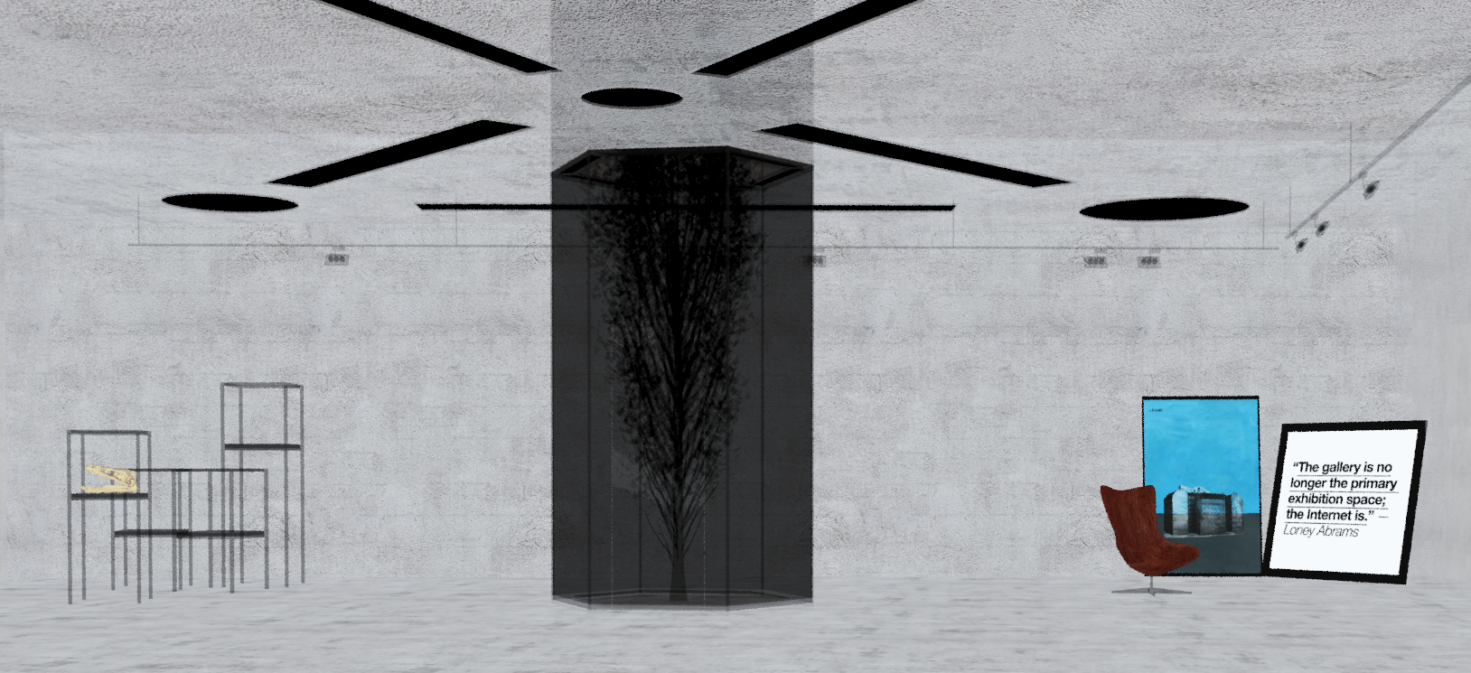
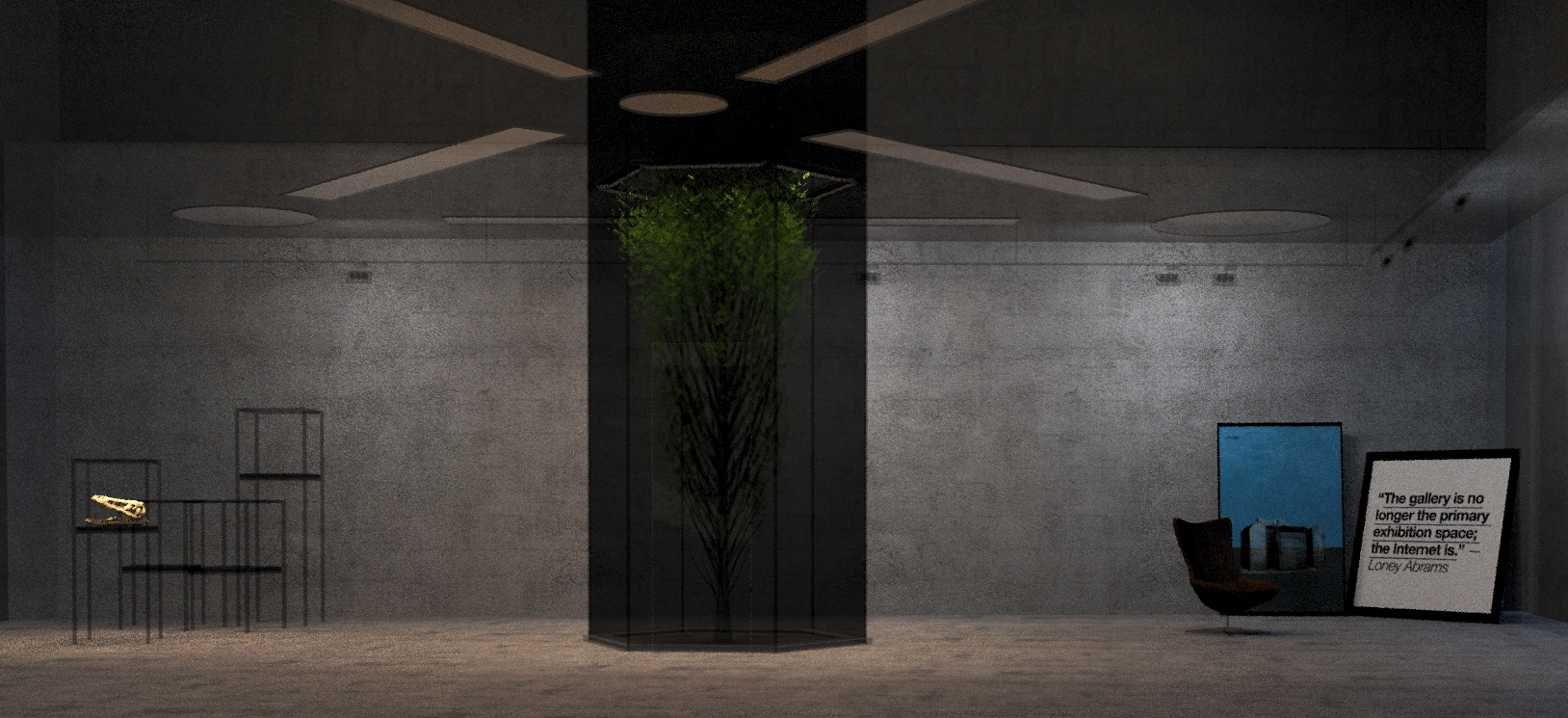
The cafe, which will be open in an area of a dense young population, will be going to organize workshops, panels, and exhibitions. Our guests going to find here free pens and papers, books, and take a chance to meet creatives.
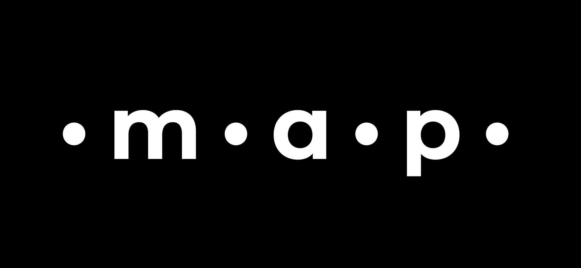
The logo consists of the initials of the three keywords summarizing the purpose. "m" for the meet (events, games, workshops..), "a" for art (exhibitions, concerts, theatre, ..), and "p" for people (panels, forums, inspiring people and well-known artists, ..) and the dots arranged in a linear order. And these keywords make sense in every aspect:
meet art people, art meets people, people meet art.
•m•a•p•'s name was used as a map metaphor to guide us in our own way, in a place where we could develop and share ourselves.

Artwork
Paula Ventura
The Silent City, 2018
Acrylic, photography, different papers
10 7/10 × 8 3/10 in
27.1 × 21 cm